Film
Directed By: The Visual Signatures of 6 Iconic Filmmakers

Pause any film on a random frame. With the great directors, you don't need the title card. The framing, the color, the way light falls — it's a fingerprint. A signature you can read before a word is spoken.
That's the part of cinema I keep coming back to: not what a director shoots, but how you know it's them. Below are six filmmakers whose visual language is so specific you could pick their work out of a lineup. Some are the canon. A couple are newer voices I think earned a spot next to them.
1. Bong Joon-ho — Architecture as Argument
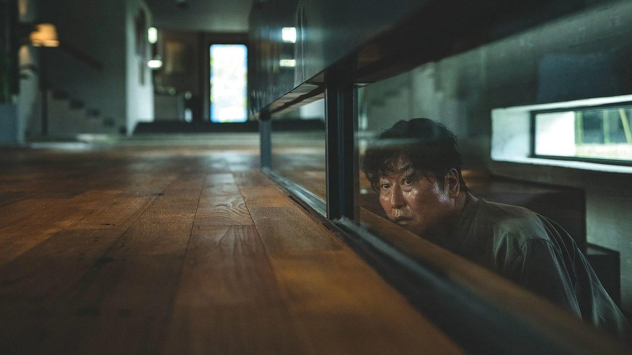
The Park house - pristine minimalism, natural light flooding through glass
Bong builds his themes into the spaces his characters move through. Parasite is the cleanest example in modern film: the Park family's glass house up high, flooded with light; the Kim family's semi-basement down low, catching whatever light leaks down to street level. Class isn't explained — it's staircases.
What this taught me: the set can deliver the thesis without a word of exposition. Water flows downhill in Parasite. So does everything else in that society. Bong also slides between comedy, thriller, and tragedy inside a single scene without the seams showing — tonal control most directors can't risk.
Look at the palette above. Warmth and openness up top, cramped earth tones below. The color follows the floor plan.
2. Ryan Coogler — Naturalism That Aches

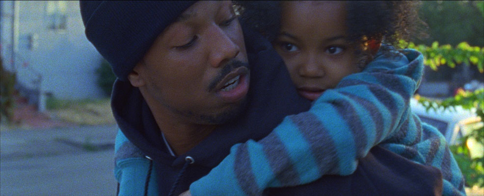
Michael B. Jordan and Ariana Neal in Fruitvale Station
Coogler shoots intimacy. Handheld, available light, faces close enough that you feel like you're intruding. Fruitvale Station plays out almost like documentary — and that closeness is exactly what makes the ending unbearable.
What this taught me: naturalism is a choice, not a default. Coogler keeps the palette muted and lived-in for most of the film, so when the fluorescent BART-station light goes clinical and cold, the shift hits like a verdict. He uses warmth as something that can be taken away.
He earned the blockbuster scale of Black Panther later, but the signature held: the camera stays at human eye level, with the people, never above them.
3. Stanley Kubrick — The Tyranny of Symmetry
Kubrick frames the world like it's already a museum exhibit. One-point perspective. Hallways that recede dead-center to a vanishing point. A face filling the frame, tilted down, eyes up — the "Kubrick stare" that tells you a character has crossed into something they can't come back from.
What this taught me: order is the scariest thing you can put on screen. The Overlook Hotel in The Shining isn't frightening because it's chaotic. It's frightening because it's perfect. The symmetry that should feel safe instead feels watched, controlled, inhuman. Kubrick made tidiness menacing.
He shot for control in every layer — the geometry, the slow zoom, the held stare. Nothing accidental ever made it into the frame.
4. David Fincher — Precision in the Dark
If a Fincher frame feels like it was machined rather than filmed, that's the point. Desaturated palettes, sickly greens and ambers, light that seems to come from a single reluctant source. Cameras that move only when they have a reason to.
What this taught me: restraint reads as authority. Zodiac, Se7en, The Social Network — Fincher removes warmth and visual noise until what's left feels clinical, surveilled, true. He famously shoots dozens of takes not for drama but to sand off every trace of performance until the acting disappears into behavior.
The color grade does half the storytelling. Drain the warmth and the audience reads dread before a single line lands.
5. Wes Anderson — The Dollhouse Frame
The opposite of Fincher's gloom, and just as instantly recognizable. Flat, head-on compositions. Centered subjects. Whip pans and snap zooms. Pastel palettes so deliberate they read like paint chips — buttery yellows, faded pinks, a very specific shade of khaki.
What this taught me: style can carry emotion the dialogue refuses to. Anderson's people are often deadpan, holding grief at arm's length. The meticulous, toy-like worlds around them do the feeling on their behalf. The symmetry isn't just cute — it's a character armoring themselves against a messy world.
Every prop, font, and color in an Anderson frame is chosen. The control is the joke and the tenderness at the same time.
6. Denis Villeneuve — Scale and Silence
Villeneuve shoots smallness against enormity. A single figure dwarfed by a monolith, a sandworm, a wall of fog. Monochromatic sequences — the orange void of Blade Runner 2049, the gray hush of Arrival — where color itself becomes information.
What this taught me: negative space is a feeling. He'll hold on emptiness, let silence stretch past comfortable, and trust the image to do the work. Where other directors cut, Villeneuve waits. The result is awe — you feel how small the human is inside the frame.
He treats scale as emotion, not spectacle. The bigness exists to make you feel something, not to sell a poster.
What the Signatures Share
Six different filmmakers, and the same lesson keeps surfacing:
- Consistency makes a style legible — repeat a choice enough and it stops being a technique and becomes a voice.
- Color and space are arguments — the great directors let the frame carry meaning the script never says out loud.
- Restraint is a signature too — Fincher's emptiness and Villeneuve's silence are as distinct as Anderson's clutter.
- The signature serves the story — none of this is decoration. The fingerprint exists because it makes you feel the thing faster than words could.
Cover the credits. The good ones already told you who they are.